During the mid-modern art period, art was becoming more diverse. Popular art styles started emerging from sculpting, to found art, to op art, to pop art. There was an art style for everyone. Within this blog, we are going to be taking a look into some of these different art styles and artists that shaped the mid modern period.
Warhol, Andy
1962
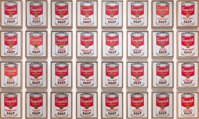
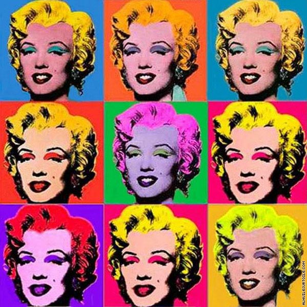
Pop art is art that is based off of modern popular culture. This showed a lot of comic strips, advertising, and abstract works in the 1950’s and 60’s. One of the most influential pop artists of all time is Andy Warhol. Warhol started out as a commercial based artist that would make art for various advertisements. These advertisements started his solo career as a pop artist. One of his most famous advertisement art pieces is his Campbell soup pictures. This piece had 32 images of the various flavors of Campbells soups side by side. The simplicity and repetition of this piece is what makes up this exhibit. The individually framed drawings of soup cans with a white background makes you really think about how something as small as soup can be turned into a statement. Personally, I understand the appeal of this art piece from an advertising standpoint, but I do not understand how it could become popular outside of that. Although this is not my favorite type of pop art, Warhol did an amazing job of making canned soup look interesting. When Warhol started showcasing his own work, it was clear that he had an interest with media. This interest led to some of his most famous pieces of celebrities like Marilyn Monroe and Elvis Presley. I chose Warhol’s painting of Marilyn Monroe as it is such an iconic Warhol painting. Again, we see a lot of pattern in the repetition of Marilyn. Like the soup photos, she is seen side by side, as if copied and pasted. The painting uses bright, abstract colors that contrast with the side by side paintings of Monroe. This method really makes Marilyn “pop” out of the painting. This style of pop are is my favorite. The art elements and representations of the media from the time period makes this style have feel more modern and exciting. Personally, this painting is one of my favorites from the time period.
Andy Warhol
1962
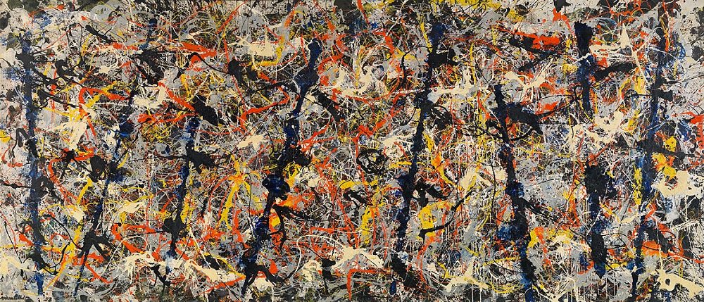
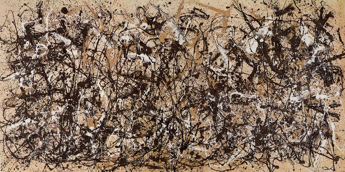
Another popular form of art from the 1940’s to 60’s was abstract expressionism. Abstract expressionism is bright, abstract paintings that were painted with gestural expressionism. Abstract expressionism was frequently splattered and poured onto the canvas to create an emotion or story with the piece. American painter, Jackson Pollock, led the movement of abstract expressionism with his classic paintings. When looking at Pollock’s paintings, his use of lines creates a very stressful scene. In both “Blue Poles” and “Autumn Rhythm,” lines are splattered all over the canvas in an unorganized fashion. Although both have this stressful appeal, the straight blue lines and bright colors in “Blue Poles” brings me a sense of security. The poles almost seem like roadblocks stopping the stress in the rest of the painting, while the other colors feel like light at the end of a tunnel. This really shows how the use of art elements can really move the emotions of the viewer. When looking at “Autumn Rhythm,” I am remined of coffee spills and bug splattered windshields. The shapeless, scattered lines and lack of color sends anxiety to me. These two very similar paintings create such varied responses in me. Personally, I really like abstract expressionism. I love that you can sense emotions of the painter based on how soft or harsh they put a painting together and the colors they use.
Jackson Pollock
1952
Jackson Pollock
1950
Lastly, conceptualism. Conceptualism is completely different from the art forms in the mid modern period. Conceptual art is art that provokes thought rather than being visually appealing. In the 1960’s Lawrence Weiner emerged with wall stencils that displayed poetic verses that the view could recreate into a personal meaning. This wall art has appealing fonts and typically a blank background for views to take in the art. What really brings people to Weiner’s exhibits is the words he displays that challenges readers, it has nothing to do with the colors, lines, or form in his work. At the end of the day it is his strong poetic language. One of his wall stencils that was interesting featured the word “REDUCED” in a large, red font covering an entire wall. I found this ironic as reduced is generally associated with being smaller, quieter. While this wall stencil is very large and loud, standing out over everything in the room. If I were able to view this in person, I believe it would make me feel reduced and smaller. Another one of these conceptual pieces of Weiner’s quoted, “Taken from the wind and bolted to the ground.” This quote really connected with me as I grew up in the military. Every time I planted my roots at a new home, before I knew it I was moved away and had to learn to build roots somewhere else. Quotes like these can relate to almost anyone and makes us stop to think.
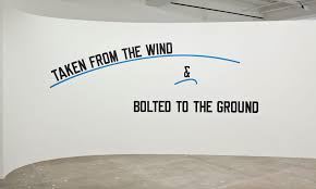
Lawrence Weiner

Lawrence Weiner
1969
References
Abstract Expressionism Movement Overview. (n.d.). Retrieved from https://www.theartstory.org/movement/abstract-expressionism/
Jackson Pollock: 100 Famous Paintings Analysis and Biography. (n.d.). Retrieved from https://www.jackson-pollock.org/
Think About It: 9 Masterpieces of Conceptual Art You Need to Know. (2018, February 8). Retrieved from https://www.artspace.com/magazine/interviews_features/book_report/9-conceptual-artworks-that-you-need-to-know-55244

You did a very good job highlighting elements that made popart so famous. I personally only like the Marilyn piece, I think there’s something unique and drawing to the eye with how contrasted the colors make the piece.
I liked, also, how you analyzed different art forms, the popart and the abstract expressionism, to really show the diversity in Modernism. I would have like to have read how each of these pieces were influenced by an event, or more on why they were done, but you did a good job.
LikeLike
We had similar takes on our assignment so I found yours to be really interesting and all of what you presented was really tasteful, to me. I liked the Monroe piece, I almost chose that one as well and it was a really great symbol to use for Pop Art. I personally really love the type of abstract expressionism that you chose. We went with similar themes although I was able to learn new material from you so thank you!
LikeLike
I like the art work you chose, but I agree that it would have been nice to see why these were made and what influenced them. I personally like the campbell soup by Warhol but could not use the piece because it did not relate to my topic. I do see that you wanted to express different forms of art and their similarities and differences. I think you have done well this semester and we made it through. Good luck with the last blog and keep up the good work.
LikeLike
Hello,
I really enjoyed your post! I enjoyed seeing the different art styles and thought you did a nice job talking about each of them. I personally like the Marilyn Monroe piece because of the fun colors and repetition. I also would agree with the other comments on this post about what influenced these pieces. Overall great job!!
Cassidy
LikeLike