Mexican Muralists

            For the non-western exhibit, I decided to focus on Mexican murals. My family roots back to Mexico, and I know nothing about their culture so I thought that an exploration in Mexican art styles might bring me closer to the culture. When looking at the different muralists work, I noticed very similar themes to include politics, hope and inclusion. In this blog, I will be diving into murals created by Jose Orozco, Diego Rivera, and David Alfaro Siqueiros.

Prometheus
1930
Jose Clemente Orozco

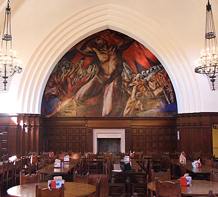
            Jose Orozco was a Mexican Muralist from the 1920’s to the late 1940’s who was a part of the Mexican Muralist Movement.  Orozco was inspired by his Mexican culture and even destroyed many of his works that he considered “too European.” In 1930, Orozco was commissioned to create a mural in Pomona College, California. Orozco used a giant portrayal of Greek Titan, Prometheus, who creates fire for this mural. The twenty-eight by twenty-foot wall has Prometheus pulling fire down from the sky onto a group of men terrified of their impending doom. It is believed that Orozco was creating a metaphor of his current world (“Prometheus: José Clemente Orozco”). I chose to showcase Orozco’s Prometheus because of the emotions that are pulled from this mural. The red and orange hues and detailed expression of Prometheus really brings the viewer into Prometheus’s wrath. This trusting Titan is pulling fire onto individuals who are now terrified for their lives. While Prometheus is painted with distinct details, the people beneath him are painted with such sweeping strokes that figures can be hard to outline. This makes me feel the power of the titan.

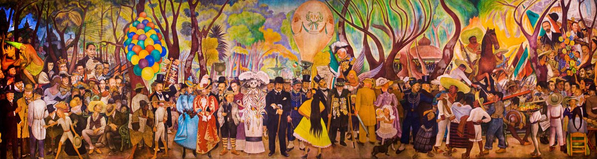
            Another notable Mexican Muralist was Diego Rivera. Rivera, who was also a part of the Mexican Muralist Movement, had explored many different cultures to create a very diverse and personalized style for his murals and art work. One of Rivera’s most popular murals takes you into his life. The 50-foot-long mural, “Dream of a Sunday Afternoon in the Alameda Central” walks you from left to life of different Mexican and Rivera’s personal historical markers in life in a chronological order. From presidents and a young Rivera to characters from Mexican mythologies, Rivera depicted a rich history and culture into one mural (“Dream of a Sunday Afternoon in Alameda Park by Deigo Rivera,”). The stories built within this mural are what makes it such an interesting and popular piece. Personally, I like that this piece allows you to read the history from left to right, making me more interested in researching about those depicted. The bright colored center and higher sky makes the eye get drawn directly to the center of the mural. This makes the chronological view more confusing. However, the fade from the darker left side of the painting to the gradual brighter, right side of the painting leads me to believe that hard times had come and gone. This may be a marker in Rivera’s personal life or in the history of the country that molded him. This is my favorite of all of the paintings in this blog. The packed scene and small details make us stop to think. Every time you look at this painting, you can find something new that will bring insight into Rivera’s story.

Dream of a Sunday Afternoon in Alameda Park
1947
Diego Rivera

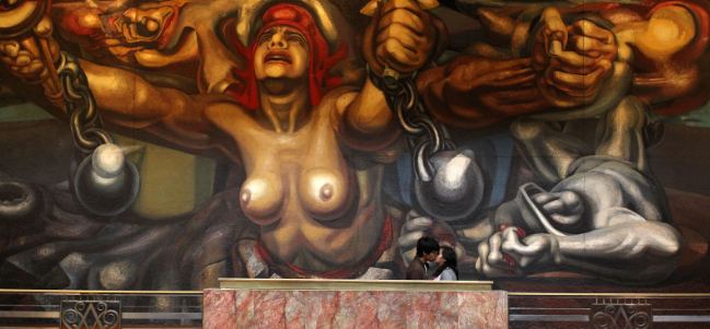
            Lastly, Mexican muralist David Alfaro Siqueiros. Siqueiros was known for the political side of his murals. One of his most famous being, “The Democracy.” This mural, painted in 1945, was made as a celebratory piece for the victory of fascism after World War 2. A woman is shackled and horrified carrying a freedom flame in one hand and a white flower in the other (“David Alfaro Siqueiros Artworks & Famous Paintings,” ). It appears as if the woman is escaping the past and leaving it far behind her. The facial expression and shackles makes it appear as if the woman is not yet out of the woods and still has more to fight for. This mural reminds me of the Prometheus painting from Orozco. The emotions from both paintings is intense and full of anger with the central figure seeming strong and powerful over everything around them. The styles of both of those paintings is visually appealing in similar ways. The immense detail and brightness of the central figure makes the eye immediately gravitate towards these giant individuals. While the contrasting colors and more faded background around these figures builds on the weaknesses of everyone else.

The Democracy
1945
David Alfaro Siqueiros

References

David Alfaro Siqueiros Artworks & Famous Paintings. (n.d.). Retrieved from https://www.theartstory.org/artist/siqueiros-david-alfaro/artworks/

Diego Rivera Maler, Künstler, Genie. (2019, February 18). Retrieved from https://www.fbuch.com/diego-rivera/

Dream of a Sunday Afternoon in Alameda Park by Deigo Rivera. (n.d.). Retrieved from https://www.diegorivera.org/dream-of-a-sunday-afternoon-in-alameda-park.jsp#prettyPhoto%5Bimage1%5D/1/

José Clemente Orozco Artworks & Famous Paintings. (n.d.). Retrieved from https://www.theartstory.org/artist/orozco-jose-clemente/artworks/

» Prometheus: José Clemente Orozco. (n.d.). Retrieved from http://art-for-a-change.com/blog/2014/02/prometheus-jose-clemente-orozco.html

Mid Modern Art Styles

During the mid-modern art period, art was becoming more diverse. Popular art styles started emerging from sculpting, to found art, to op art, to pop art. There was an art style for everyone. Within this blog, we are going to be taking a look into some of these different art styles and artists that shaped the mid modern period.

Campbell Soup Cans
Warhol, Andy
1962

              Pop art is art that is based off of modern popular culture. This showed a lot of comic strips, advertising, and abstract works in the 1950’s and 60’s. One of the most influential pop artists of all time is Andy Warhol. Warhol started out as a commercial based artist that would make art for various advertisements. These advertisements started his solo career as a pop artist. One of his most famous advertisement art pieces is his Campbell soup pictures. This piece had 32 images of the various flavors of Campbells soups side by side. The simplicity and repetition of this piece is what makes up this exhibit.  The individually framed drawings of soup cans with a white background makes you really think about how something as small as soup can be turned into a statement. Personally, I understand the appeal of this art piece from an advertising standpoint, but I do not understand how it could become popular outside of that. Although this is not my favorite type of pop art, Warhol did an amazing job of making canned soup look interesting. When Warhol started showcasing his own work, it was clear that he had an interest with media. This interest led to some of his most famous pieces of celebrities like Marilyn Monroe and Elvis Presley.  I chose Warhol’s painting of Marilyn Monroe as it is such an iconic Warhol painting. Again, we see a lot of pattern in the repetition of Marilyn. Like the soup photos, she is seen side by side, as if copied and pasted. The painting uses bright, abstract colors that contrast with the side by side paintings of Monroe. This method really makes Marilyn “pop” out of the painting. This style of pop are is my favorite. The art elements and representations of the media from the time period makes this style have feel more modern and exciting. Personally, this painting is one of my favorites from the time period.

Marilyn Diptych
Andy Warhol
1962

              Another popular form of art from the 1940’s to 60’s was abstract expressionism. Abstract expressionism is bright, abstract paintings that were painted with gestural expressionism. Abstract expressionism was frequently splattered and poured onto the canvas to create an emotion or story with the piece. American painter, Jackson Pollock, led the movement of abstract expressionism with his classic paintings. When looking at Pollock’s paintings, his use of lines creates a very stressful scene. In both “Blue Poles” and “Autumn Rhythm,” lines are splattered all over the canvas in an unorganized fashion. Although both have this stressful appeal, the straight blue lines and bright colors in “Blue Poles” brings me a sense of security. The poles almost seem like roadblocks stopping the stress in the rest of the painting, while the other colors feel like light at the end of a tunnel. This really shows how the use of art elements can really move the emotions of the viewer. When looking at “Autumn Rhythm,” I am remined of coffee spills and bug splattered windshields. The shapeless, scattered lines and lack of color sends anxiety to me. These two very similar paintings create such varied responses in me. Personally, I really like abstract expressionism. I love that you can sense emotions of the painter based on how soft or harsh they put a painting together and the colors they use.

Blue Poles
Jackson Pollock
1952
Autumn Rhythm
Jackson Pollock
1950

              Lastly, conceptualism. Conceptualism is completely different from the art forms in the mid modern period. Conceptual art is art that provokes thought rather than being visually appealing. In the 1960’s Lawrence Weiner emerged with wall stencils that displayed poetic verses that the view could recreate into a personal meaning. This wall art has appealing fonts and typically a blank background for views to take in the art. What really brings people to Weiner’s exhibits is the words he displays that challenges readers, it has nothing to do with the colors, lines, or form in his work. At the end of the day it is his strong poetic language. One of his wall stencils that was interesting featured the word “REDUCED” in a large, red font covering an entire wall. I found this ironic as reduced is generally associated with being smaller, quieter. While this wall stencil is very large and loud, standing out over everything in the room. If I were able to view this in person, I believe it would make me feel reduced and smaller. Another one of these conceptual pieces of Weiner’s quoted, “Taken from the wind and bolted to the ground.” This quote really connected with me as I grew up in the military. Every time I planted my roots at a new home, before I knew it I was moved away and had to learn to build roots somewhere else. Quotes like these can relate to almost anyone and makes us stop to think.

TAKEN FROM THE WIND & BOLTED TO THE GROUND
Lawrence Weiner
REDUCED
Lawrence Weiner
1969

References

Abstract Expressionism Movement Overview. (n.d.). Retrieved from https://www.theartstory.org/movement/abstract-expressionism/

Jackson Pollock: 100 Famous Paintings Analysis and Biography. (n.d.). Retrieved from https://www.jackson-pollock.org/

Think About It: 9 Masterpieces of Conceptual Art You Need to Know. (2018, February 8). Retrieved from https://www.artspace.com/magazine/interviews_features/book_report/9-conceptual-artworks-that-you-need-to-know-55244

Art and the Great Depression

From 1929 to 1939, the great depression collapsed the idea of the American dream. As the stock market dropped, companies lost money and 25 percent of citizens lost their jobs, leaving them and their families bankrupt. This depression made families lose hope and dignity as they scraped towns for food and shelter. By 1933, as Franklin Roosevelt took over as president, everyone was searching for change.  This search for something better and the continuing pain of citizens was widely represented in this decades art.

Maynard Dixon was an artist at the time who would often paint images that depicted young men from the time period who appeared to be desolate. An example of one of Dixon’s painting, “Forgotten Man,” has a man who is sitting on a busy sidewalk with his head low and a frown on his face. This man is a representation of the average American man at the time. I really like the emotion in this painting, I can’t help but feel for this struggling individual, broken down on the side of the street. The faded, cool toned colors and deep shadowing on this man make it clear that this painting is a sad, rough moment for him. While the straight, poised lines that shape the legs walking behind this man show me that they are some of the population who are employed and headed to work. The clothes appear to be put together and clean, while the feet appear to be moving quite quickly. This leaves these individuals no time to even look at the gloomy man.

Along with art that represented exactly what was happening during the great depression, some art was made in hopes of the great depression ending. In 1933, John Steuart Curry painted “Kansas Corn Field.” This painting was of a tall, bright yellow flourishing stock of corn. This is significant as the painting was made at the end of the great depression’s drought. Curry painted this perfect stock of corn likely with hopes that corn fields would again be this vibrant and full. The colors and movement of this painting makes the stock come to life, the bright yellows and greens make for healthy crops.

Lastly, Grant Wood’s landscape paintings showcased the US prior to the great depression. My favorite painting from this decade was Wood’s “Stone City, Iowa.” This painting is a landscape of the town Wood was from. This peaceful scene features rolling hills and a small town after the town became barren from the shutdown of the local quarries and loss of jobs in the area. With industrialization leaving small towns like Stone City behind, Wood was able to show us a prime example of some of those small farming towns that were left behind during the depression. The texture of this painting really draws me into the small town. The bubbly treetops, soft hills, and prickly corn crops peaking out of the dirt makes this image stand out in a very modern way. The bright color pallet and realism techniques makes the environment welcoming and calm.

References

Corn Fields and Greed: John Steuart Curry. (n.d.). Retrieved from https://thefineartdiner.blogspot.com/2011/07/corn-fields-and-greed-john-steuart.html

Waiting for the redirectiron… (n.d.). Retrieved from https://moa.byu.edu/hard-times-maynard-dixons-paintings-of-the-great-depression/

Realism vs. Impressionism

Jules Breton
Song of the Lark
Oil on Canvas

            During the romantic period, art was becoming more diverse with many different styles populating in this era. Different art styles would depict artists different preferences, beliefs and knowledge of art itself. The are styles from this era that we will explore is realism and impressionism. Although both of these styles were very popular at the time, they are very different from each other.

Realism tended to represent ordinary people, doing ordinary things. The entire concept of realism was portraying something that was real. This resulted in paintings that looked like photographs of everyday life. The harsh, sharp lines and shadowing would create a story around a moral subject. This allows us to look back into the lives of those from the time period. The authentic appeal of these paintings makes them my favorite style from the era. When looking at the painting “Song of the Lark,” by Jules Breton, the woman’s emotion is read on her face as she stands in a field ready to work at sunrise. Nothing about this woman is hidden.  With realism, artists were also able to bring attention to social inequality. For the painting, “Barge Haulers on the Volga,” Ilya Repin, painted a depiction of the lower class. In this painting, a group lower classed men are hauling a boat, the expressions on the men’s faces are emotionless, almost dead, appearing dark compared to the bright scenery around them. However, a boy in the group appears lit up with a confused look on his face. This painting was showing the struggle the lower class goes through with the boy being a symbol of hope that the struggle may one day end (theartstory). The amazing attention to detail in the painting really tells the story itself.

Ilya Repin
Barge Haulers on the Volga

With the sharp details and picture-perfect representation that is brought from realism, its easy to see why impressionism is a conflicting style. Impressionism is art that has soft brush strokes and bright colors. Impressionism paintings appear like a dream, colors and objects are blended smoothly making the environment blurry and hard to understand. Art critic, Louis Leroy described the style to be unfinished, which I honestly agree in some ways (Khan Academy).  The lack of detail makes the paintings have a smudge or erased effect. Although the blurred details in this style were not my favorite, I do enjoy the soft, bright colors that most impressionism paintings held. For the majority of impressionism paintings, a peaceful setting was created with lighter colors that strayed away from dark shadowing for detail. In Claude Monet’s painting, “Woman with Parasol,” soft blue, green and tans were used to create a picture of a woman carrying an umbrella with a young boy behind her. The cool tones and soft skies made this painting bring a calm sensation over me.

Claude Monet
Woman with Parasol
Claude Monet
Self Portrait

References

A beginner’s guide to Impressionism. (n.d.). Retrieved from https://www.khanacademy.org/humanities/becoming-modern/avant-garde-france/impressionism/a/a-beginners-guide-to-impressionism\

Realism Movement Overview. (n.d.). Retrieved from https://www.theartstory.org/movement-realism.htm

Scientific Influences in the Classical Era

Sir Isaac Newton
by Sir Godfrey Kneller
oil on canvas, 1702

During the classical era, influences in art started shifting from religious work to art that focused more on the sciences. With advances in astronomy, Sir Isaac Newtons findings, and the discovery of Pompei, the 18th century’s technology was rapidly growing. These scientific discoveries inspired art that focused on realism and historical events while still presenting a playful and light mood. Many works of art were inspired by Sir Isaac Newton after his principles in gravity, development of a color theory and integral calculus, these discoveries would name Newton as one the greatest and most influential scientist to have ever lived (“Isaac Newton”).

            The first painting I found that had a connection to Newton and the sciences of the era was a portraiture of Newton himself. This portrait was painted by Godfrey Kneller. In this painting, Newton is given a softer look, with lines bringing realism to Newtons face. The dark background and shading seems to be more like the baroque era, bringing out Newton’s appearance with no distractions. This is a great painting as it gives us insight on Newton himself. In this portrait, Kneller was painting Newton as a public figure, this just shows how both Newton and Kneller were at high points in their careers (“Portraits of Isaac Newton”).

About 30 years later, following Newton’s death, Giovanni Battista Pittoni, and two other artists worked together to create a painting memorializing Newton’s accomplishment. This painting, completed around 1730 had a tomb of Newton surrounded by God’s and ancient scholars (Dominiczak, 2012). This painting featured the light colors, imagination, and rounded architecture, that is presented in the classical eras rococo themes. I really liked how the artist depicted the sciences at the time, using their knowledge of scholars, they symbolized Newton as the greatest scientist of all time with other great scholars mourning his death. The shape of the architecture in this painting really draws the eye the elaborate detail in the architectural structure itself. Generally, lines draw your eye to the focus of the painting, however, the large spacing between the scene and architecture, along with the natural curved lines on the ceiling, brings attention to the detailed patterns in the ceilings décor.

Giovanni Battista Pittoni, Domenico Valeriani, and Giuseppe Valeriani. Allegorical Monument to Sir Isaac Newton. Oil on canvas

Along with all of Newton’s great discoveries, there were other scientists and advances that shaped the science and art during the classical era. A prime example is the discovery of Pompei. Although the site was discovered in the 1500’s, it wasn’t until the 1700’s that early archeologists started excavating the site. With thorough explorations in the city, it was found that the site was completely preserved, holding the shape and appearance of architecture, objects that shaped the lives of those from the city, and calcified shells that held the shape of the cities encapsulated residents. The scientific theories that came from the site of Pompeii attracted many visitors to the site inspiring writings, paintings, and a thirst for knowledge on the subject matter. Pierre-Jacques Volaire’s painting, An Eruption of Vesuvius by Moonlight, was painted with the city of Pompeii and the eruption that ultimately destroyed the city in mind (“Pompeii’s Influence on 18th Century Art · The Discovery of Pompeii and Herculaneum · Piranesi in Rome”). Volaire imagined the eruption in light, almost peaceful painting. This painting really struck me because of the beautiful scenery and the calmness that is portrayed with the soft, light colors and rococo elements. Half of this painting has colors that bring about calmness, with the blues of the water and the moon peaking out of the soft clouds of the right side of the painting. As you shift your eyes to bright, burning red and orange hues on the left side of the painting, you begin to see the burning volcano coming towards a fearful community. The emotions in this painting make it my favorite out of the three paintings covered.

Pierre-Jacques Volaire’s painting An Eruption of Vesuvius by Moonlight,1774

References

Dominiczak, M. E. (2012, March 1). Science and Culture in the 18th Century: Isaac Newton. Retrieved from http://clinchem.aaccjnls.org/content/58/3/655

Isaac Newton. (n.d.). Retrieved from http://www.absoluteastronomy.com/topics/Isaac_Newton#encyclopedia

Pompeii’s Influence on 18th Century Art · The Discovery of Pompeii and Herculaneum · Piranesi in Rome. (n.d.). Retrieved from http://omeka.wellesley.edu/piranesi-rome/exhibits/show/discovery-of-pompeii-and-hercu/pompeii-art-influence

Portraits of Isaac Newton. (n.d.). Retrieved from https://www.classe.cornell.edu/~critten/gravity/NewtonPortraits.html

Caravaggio’s Connection to the Council of Trent.

Caravaggio, Michelangelo. David with the Head of Goliath. Oil Painting. 1610. http://www.caravaggio.org/david-with-the-head-of-goliath.jsp#prettyPhoto%5Bimage2%5D/0/.

During the mid- 1500’s, the protestant reformation and Martin Luther challenged the Catholic Church. “They argued for a religious and political redistribution of power into the hands of the bible-and pamphlet-reading pastors and prices,” (Editors). This power struggle led the catholic church to rebuttal with sessions that would redefine the catholic churches ideals, these sessions were known as the Council of Trent. Throughout these sessions, many topics on Catholic practices were mentioned including art. Prior to the council’s changes, biblical art portrayed unclear stories that distracted viewers, leading away from the importance of the story. Lumen learning describes the rules on art placed by the Council of Trent explaining, “Art that portrayed religious figures or scenes followed Protestant theology by depicting people and stories accurately and clearly and emphasized salvation through divine grace, rather than through personal deeds, or by intervention of church bureaucracy,” (“Northern Renaissance | Boundless Art History”). The council was looking for art that clearly depicted a story, allowing more people to learn about the Catholic religion.

Italian Artist, Michelangelo Caravaggio’s paintings followed the rules set forth by the Council of Trent, using single subjects and telling short biblical stories in his work. When looking at his paintings, the contrast between the story being told and the background shows the simplicity Caravaggio put into his work and how he alluded from any distractions outside of the individuals portrayed. The painting I focused on for this example is Caravaggio’s “David with the Head of Goliath.” The moment in this story is clear and to the point, with any props staying in focus with David and Goliath. There is no way to sway the story portrayed in this painting.

This painting falls in theme with most of the art from the Baroque era due to the art elements presented. Most notably, the painting is very theatrical, with the contrast between the light subject and dark background and the depiction of such a dramatic scene. There is also a lot of texture in this painting that makes it more lifelike, on Goliath’s head you can see individual veins and hairs and the shading on David makes this look more like a photograph. These realistic features on the painting makes this painting seem like a real story rather than a connection or piece of a story, like the Council of Trent intended.  

Works Cited

Editors, History.com. “The Reformation.” HISTORY, 11 Apr. 2019, http://www.history.com/topics/reformation/reformation.

“Medici: Godfathers of the Renaissance . Renaissance . Counter Reformation | PBS.” PBS: Public Broadcasting Service, http://www.pbs.org/empires/medici/renaissance/counter.html.

“The Northern Renaissance | Boundless Art History.” Lumen Learning – Simple Book Production, courses.lumenlearning.com/boundless-arthistory/chapter/the-northern-renaissance/.

Portraitures from the Renaissance.

“Portrait of a Young Woman”, Sandro Botticelli, 1475, tempera on wood panel

When looking at art pieces from the Italian and Northern Renaissance, portraitures were the most interesting to me. I love that with these portraits, I can get a sense of the fashion and beauty ideals during the time.  I was also amused that owning a self portrait brought upon a sense of power. When searching for the perfect portrait to present, I found “Portrait of a Young Woman” by Sandro Botticelli. This portrait stood out amongst all of the others because this portrait looked more modern and detailed than the others.  When studying this portrait, it is clear that the painting exhibits humanism.

According to Arty Factory, humanism is an element that really shaped art during the Italian Renaissance. The ideal of humanism mainly focused on the individual being responsible for their destiny (“Italian Renaissance Art – Humanism,” n.d.). Portraitures were made to encapsulate the success of the individuals and be able to share this success over time. This way of expressing the power and success of individuals really puts the humanism ideal into these portraits. The woman in the “Portrait of a Young Woman,” was rumored to be a portrait of Simonetta Cattaneo de Candia Vespucci, the most beautiful woman in Florence at the time of the portrait (“”Portrait of a Young Woman” by Sandro Botticelli | Daily”). This portrait, along with many others that were inspired by Simonetta, has shared her beauty and represented her success for hundreds of years.

This portrait is specifically appealing because of its use of art elements. When looking at this portrait, I immediately see the use of texture on this subject. The woman in the painting’s hair is very textured in a natural way. Botticelli uses optical texture to display the individual hairs of this woman while giving her softer facial features. This really makes her hair stand out of the painting in comparison to everything else on the frame.

The colors in this portrait really sets a mood towards this woman. Soft, bright colors are used, making the woman appear calm and cheerful even though she has a straight face. The color really made this portraiture stand out compared to others in the same time period. Most portraitures featured dark and dull colors making the subjects seem sad and distant. This portrait just made me feel closer to the subject and more welcomed.

Overall, I find this piece to be not only visually appealing, but I appreciate the way this portrait displays beauty ideals during the renaissance. The humanism depicted in this may display vanity, but I love the idea of the individual living on long past their life through a painting!

Works Cited

“Italian Renaissance Art – Humanism.” http://www.artyfactory.com/art_appreciation/art_movements/italian-renaissance/italian-renaissance-art-humanism.html.

“”Portrait of a Young Woman” by Sandro Botticelli | Daily.” 25 Jan. 2018, http://www.myddoa.com/portrait-of-a-young-woman-sandro-botticelli/.

The Elements of Norman Rockwell’s, “The Gossips.”

Norman Rockwell (1894-1978), “The Gossips,” 1948. Painting for “The Saturday Evening Post” cover, March 6, 1948. Oil on canvas. Private collection.

For this assignment, I couldn’t help to think back to a Norman Rockwell painting that I have always admired. In this painting, a group of people are seen speaking in a line to different people, seemingly spreading information… or gossip. I don’t know why, but I am always drawn to the humorous details and life lessons that are brought out in this work of art.

When looking for art elements in Rockwell’s painting, I was beginning to understand why those who look at this painting go through so many emotions. Rockwell uses lines in this painting to naturally draw your eye to the first women in the gossip chain and allows your eyes to naturally lead you through the path of the gossip. This is done by slight gestures drawn of the men and women on the paper to the repetition of the last person spoken to. The lines can also represent emotion. Rockwell uses the effects of our natural ability to read body language and displays it in the painting so we know how each individual in the frame feels about whatever it is being spread.

 With the art element of color, you see a lot of color used for repetition. Each individual in the painting almost appears to be in the same room. Their clothes are the same color, their skin appears to be lit in the same lighting, and everything around them is blank. This could be Rockwell’s way of letting the viewer imagine where each individual is placed in the world when they spread the gossip.

A very big part of this painting has to do with patterns. A gossip chain itself is a natural pattern that we all are a part of. In this painting, it is very obvious that pattern is used as repetition. The people in this painting are all doing the same thing (gossiping) and characters are even mimicked repeating gossip they just heard to the next person in line. This repetition truly shows us the different emotions that the individuals in the painting are feeling and it really helps us to follow along with the story line Rockwell was trying to paint for us. I can also see natural patterns in this painting as Rockwell painted a realistic version of the emotions that we go through when talking about others. You see all emotions across the board from laughter, anger, surprise and sadness. Rockwell displays this using real models to mimic these emotions.

These elements of art, along with shape, tone, texture and form really make up what I and many other admirers love about this painting. When doing some research on the painting itself, I learned that Rockwell had imagined this painting years before he ever started it. It wasn’t until he pictured himself as the reason for all the gossip that he decided to paint it (“Norman Rockwell Museum Welcomes Back Norman Rockwell’s “The Gossips””).  This really connects with me as I and almost everyone else have had something about them spread. This really puts the entire painting into perspective and made me think of how useless it is to gossip about other people. Although this painting to me is humorous and relatable, when my family saw it, I learned about all of the different emotions that they believed conveyed this painting. I would own this painting, just so I could the emotions brought out from outside perspectives.

“Norman Rockwell Museum Welcomes Back Norman Rockwell’s “The Gossips”.” Norman Rockwell Museum, 1 Mar. 2017, http://www.nrm.org/2014/02/norman-rockwell-museum-welcomes-back-norman-rockwells-the-gossips/.

Welcome

Hello Everyone,

My name is Angela Rodriguez and I major in Communications with a minor in Digital Journalism. I work with kindergarteners in a before and after school program and on my free time I like being physically active or outdoors by hiking, biking or just going to the gym. I don’t have a lot of experience with art, aside from playing multiple musical instruments and playing with photography for my major. I also have found myself doing a lot of art at work. Some of the children’s favorite activities are art projects, which forces me to learn about different art styles. Some of my favorite art activities I have done with the children were sand paintings, making food bank related sculptures and incorporating nature into an art piece after an afternoon walk. I don’t really attend any art events, or own any art pieces (that aren’t made by six year old’s), but my favorite kind of art to look at is anything floral with bright colors. I really like the simplistic and delicate look of a flower. The image included in this blog post is a great example of the kind of art that appeals me.

With some research, I found an article about how a women finds inspiration for her art pieces and how she loves the process of going through her garden to get this inspiration to start a new work https://infoweb-newsbank-com.proxy.library.uaf.edu/apps/news/document-view?p=WORLDNEWS&docref=news/1734055D6AF8E290. I really liked this article because it reminded me of the steps we have to take as students to get inspiration for each of our classes papers, projects or actual pieces of art. This process can work in the academic, professional, and entertainment parts of each individuals life.

Oil Pastel Sunflower
<a href="http://<a href="https://paintingvalley.com/sunflower-painting-images&quot; title="Sunflower Painting Images"><img src="https://paintingvalley.com/images/sunflower-painting-images-21.jpg&quot; width="350" />http://<a href=”https://paintingvalley.com/sunflower-painting-images&#8221; title=”Sunflower Painting Images”><img

Design a site like this with WordPress.com
Get started